We've learn about the scatter plot in excel.Below are several objectives of learning excel.
| objectives |
- Enter and format data in an Excel spreadsheet in a form appropriate for graphing
- Create a scatter plot from spreadsheet data
- Insert a linear regression line (trendline) into the scatter plot
- Use the slope/intercept formula for the regression line to calculate a x value for a known y value
- Explore curve fitting to scatterplot data
- Create a connected point (line) graph
- Place a reference line in a graph
|
If you click this
link, you will be able to know more about excel.
Below are some of my work done by using excel.
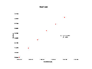 |
| Beer's Law |
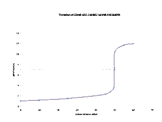 |
| Titration of 50 mL of 0.1M HCL with 0.1M NaOH |
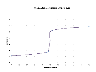 |
| Titration of 50 mL of 0.1M HCL with 0.1M NaOH |
 |
| The graph of temperature versus percentage injured |
 |
| The graph of year versus housing start |
No comments:
Post a Comment